F1 Logo and Brand Spotlight

The Logo Creative™ ✏
5 min readFeb 15, 2018

--

To the untrained eye, Formula 1 just looks like a procession of cars around a track, but to the enthusiast, the sport is full of suspense, precision, and risk. Formula 1 had its first race all the way back in 1950, and has entertained and surprised ever since. The sport is the fastest and most valuable racing series in the world; boasting the best drivers, mechanics, and sponsors. Millions view each race as the competition travels around the globe.

F1 Logo and Brand Spotlight

Formula 1 Cars Racing

Formula 1 isn’t just a sport anymore it is a worldwide brand. So with every good need a good logo. Within the last year, the Formula 1 sport had been sold to Liberty Media who have decided to rebrand, and task the creation of a new logo to Wieden + Kennedy based in London.

This is what they said about their creation:

“Creatively, the challenge was to reposition Formula 1 as a forward-facing entertainment brand, which works across a multitude of channels. The new mark embodies the core forces of Formula 1 racing: speed, attack, and control; while its sleek, sharp interlocking components celebrate the technical prowess of Formula 1 engineering teams.

Its aesthetic is aspirational and leans into the future, but extends naturally from a rich heritage of motorsport graphics.”

Before we look at the new logo, let’s have a look at the one that has been left behind after representing the sport for 23 years. The old logo featured the initials F1, much like the new one. At first glance, the red triangles looked like the 1. However, when you look closer you realise that the 1 is actually found in the negative space between the other two features of the logo.

F1 Logo and Brand Spotlight

Old Formula One Logo Featuring a Clever Use of Negative Space

The new Formula 1 logo features just the initials of the sport too. The F is curved and has a line through the middle representing the track that the drivers race on. The 1 isn’t as subtle as it was in the last logo, being just next to the F and acting almost as a track boundary. Overall the logo in harkening back to the old era of motorsport with a vintage feel, while also looking clean and modern. The choice of colours, red and black, were already established in the old logo. The red in the new creation is slightly brighter, differentiating the two even more.

F1 Logo and Brand Spotlight

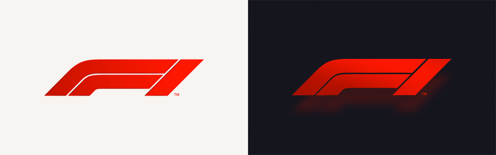
The New Formula One Logo Created by Wieden + Kennedy

This slideshow requires JavaScript.

A number of versions of a logo design were put together (these formed part of an internal book that put all the variants together in one place), the final selected logo was actually a favourite throughout the design process.

“When that one went on the board … it just didn’t come down; it’s one of those ones that had a kind of presence to it,”

“Quite frankly I just thought, look, there’s no way that we’re going to do an ‘F’ and ‘1’ any better than they’ve done it; it’s a beautifully simple way of doing it. We knew that we were up against a very good logo, [one] that has a huge amount of heritage to it, and that if we were going to blow it up then there had to be a methodology and a reasoning to it.”

said Richard Turley who is the Executive Creative Director of content and design and led the creative team for Wieden+Kennedy London

The logo is complemented by a suite of typefaces designed by Marc Rouault, a young French designer whose portfolio had impressed Turley and the design team.

The typefaces created for the sport will be used on promotional materials. All three fonts look futuristic while adding a small amount of retro flair at the same time. All the fonts are Sans-Serif and nicely rounded to fit in with the overall presentation.

F1 Logo and Brand Spotlight

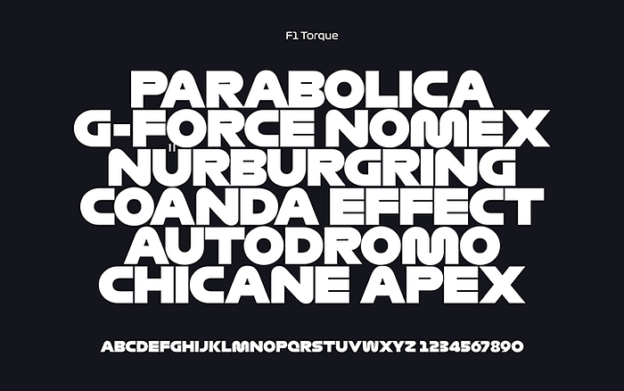
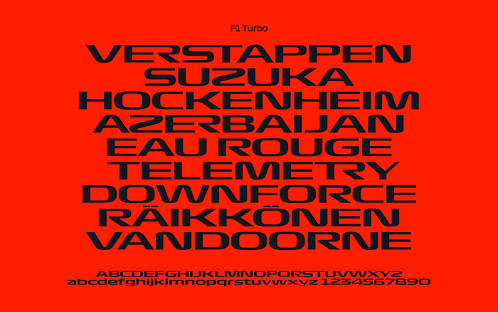
The Three New Typefaces For Use on F1 Material Created by Marc Rouault

The reception to the new logo was mixed. Many fans still liked the old style and felt that the new rebrand was a way of showing that the sport was under new management. As a Formula 1 fan myself, I was slightly upset with the new logo too, as I thought the old one was doing a great job representing the sport. However, now I’ve looked at the new logo and its uses, I can see it working well in the new era of the sport that Liberty Media will bring us. I believe the new logo looks clean, simple, and sporty, and should be a good representation of the sport for years to come.

Skip to main contentSkip to toolbar Dashboard Jetpack Dashboard Settings Posts All Posts Add New Media Library Add New Comments Profile Tools Collapse menu About WordPress The Logo Creative | Logo Design & Br… 00 comments awaiting moderation New View Post SEOOK SEO score Hi, Jude CoramJude Coram Log Out Help Screen Options Edit Post Add New Post draft updated. Preview post Dismiss this notice. Enter title here F1 Logo and Brand Spotlight Permalink: https://www.thelogocreative.co.uk/f1-logo-and-brand-spotlight/ ‎Edit Get Shortlink Add Media Add Form Add Contact Form VisualTextPage Builder File Edit Insert View Format Table Tools Paragraph Georgia 12pt 4 Word count: 751 Draft saved at 2:41:20 pm. Last edited by Jude Coram on 8th February 2018 at 2:03 pm Toggle panel: Medium Medium Cross-post as: Public Edit Edit Cross-post option License: All rights reserved Edit Edit Medium license Cross-link posts: No Edit Edit cross-link status Notify Medium followers: Yes Edit Edit follower notification Create in publication: None Edit Edit target publication Toggle panel: Publish Publish Save Draft Preview (opens in a new window) Status: Draft Visibility: Public Revisions: 3 Browse Browse revisions Duplicate This Enable public preview Readability: OK SEO: OK Move to BinSubmit for Review Toggle panel: Format Format Post Formats Standard Aside Image Video Quote Link Gallery Toggle panel: Categories Categories All Categories Most Used Brand Spotlight Book Review Branding Business Startup Tips Design Books Design Essentials Design Resources Designer Interview Designer Spotlight Free Fonts Freelance Graphic Design Inspiration Interviews Learn Design Learn Logo Design Logo Case Studies Logo Design Logo Design History Logo Design Tips Logos For Sale Marketing News Photography Technology Uncategorized Web Design Toggle panel: Tags Tags Add New Tag Add Separate tags with commas Remove term: Brand BrandRemove term: Brand Spotlight Brand SpotlightRemove term: Branding BrandingRemove term: Design DesignRemove term: F1 F1Remove term: Formula 1 Formula 1Remove term: Graphic GraphicRemove term: Logo LogoRemove term: Racing RacingRemove term: Spotlight Spotlight Choose from the most used tags Toggle panel: Append a Ninja Form Append a Ninja Form Toggle panel: Page settings Page settings Page Layout Menu Position Page Title display Display the page title on this page. Masthead Bottom Margin enable Include the margin below the masthead (top area) of your site. Footer Top Margin enable Include the margin above your footer. Hide Masthead hide Hide the masthead on this page. Hide Footer Widgets hide Hide the footer widgets on this page. Toggle panel: Featured Image Featured Image F1 Brand Spotlight - The Logo Creative Click the image to edit or update Remove featured image Toggle panel: Cresta Social Share Counter Cresta Social Share Counter Hide icons in this page? Toggle panel: Post Adverts Post Adverts Advert Title: Disable Adverts Check this option if you wish to disable all Post Ads from displaying on this content. Toggle panel: Yoast SEO Yoast SEO Need help? Go Premium Content optimisation OK SEO scoreSocial Readability OK Keyword: F1 Logo and Brand Spotlight OK SEO score + Add keyword Snippet preview Show information about the snippet editorYou can click on each element in the preview to jump to the Snippet Editor. SEO title preview:F1 Logo and Brand Spotlight Slug preview:https://www.thelogocreative.co.uk/f1-logo-and-brand-spotlight/ Meta description preview:F1 Logo and Brand Spotlight | In this edition of The Logo Creative Brand Spotlight, we take a look at the new Formula 1 rebrand Edit snippet Focus keyword Show information about the focus keywordEnter a focus keyword F1 Logo and Brand Spotlight This article is cornerstone content Analysis Show information about the content analysis Problems (3) The focus keyword doesn't appear in the first paragraph of the copy. Make sure the topic is clear immediately. The keyword density is 0%, which is too low; the focus keyword was found 0 times. No internal links appear in this page. Consider adding some as appropriate. Improvements (4) Considerations (1) Good (6) Toggle panel: Yuzo post options Yuzo post options View Include / Exclude Disable related post If you check this option you will not be displayed on this post related post. Views Number of visits by Yuzo 4 Your IP address is: 86.4.22.78 Thank you for creating with WordPress. Version 4.9.4 Close media panel Add Media Create Gallery Create Audio Playlist Create Video Playlist Featured Image Insert from URL Add Media Upload FilesMedia Library Filter by typeFilter by dateSearch Media Search media items... Deselect ATTACHMENT DETAILS F1-Brand-Spotlight-The-Logo-Creative.jpg 8th February 2018 73 KB 1080 × 675 URL https://www.thelogocreative.co.uk/wp-content/uploads/2018/02/F1-Brand-Spotlight-The-Logo-Creative.jpg Title F1 Brand Spotlight - The Logo Creative Caption Alt Text F1 Brand Spotlight - The Logo Creative Description F1 Brand Spotlight - The Logo Creative ATTACHMENT DISPLAY SETTINGS Alignment Link To Size 1 selected Clear Insert into post Choose FilesPaste is now in plain text mode. Contents will now be pasted as plain text until you toggle this option off. If you’re looking to paste rich content from Microsoft Word, try turning this option off. The editor will clean up text pasted from Word automatically.×Paste is now in plain text mode. Contents will now be pasted as plain text until you toggle this option off. If you’re looking to paste rich content from Microsoft Word, try turning this option off. The editor will clean up text pasted from Word automatically.

--

--

The Logo Creative™ ✏

Written by The Logo Creative™ ✏

Award Winning International Brand Identity Design Studio: Creating Adaptable Visual Identities that are Memorable & Timeless. Working With Clients Globally.

No responses yet